Tableau Software Visualizations from 7B Software, Inc.
The big takeaway on all interesting dashboards: It's all about the data quality. In these examples, 90% of the work went into normalizing and cleaning the data, so that the results are accurate and trustworthy.
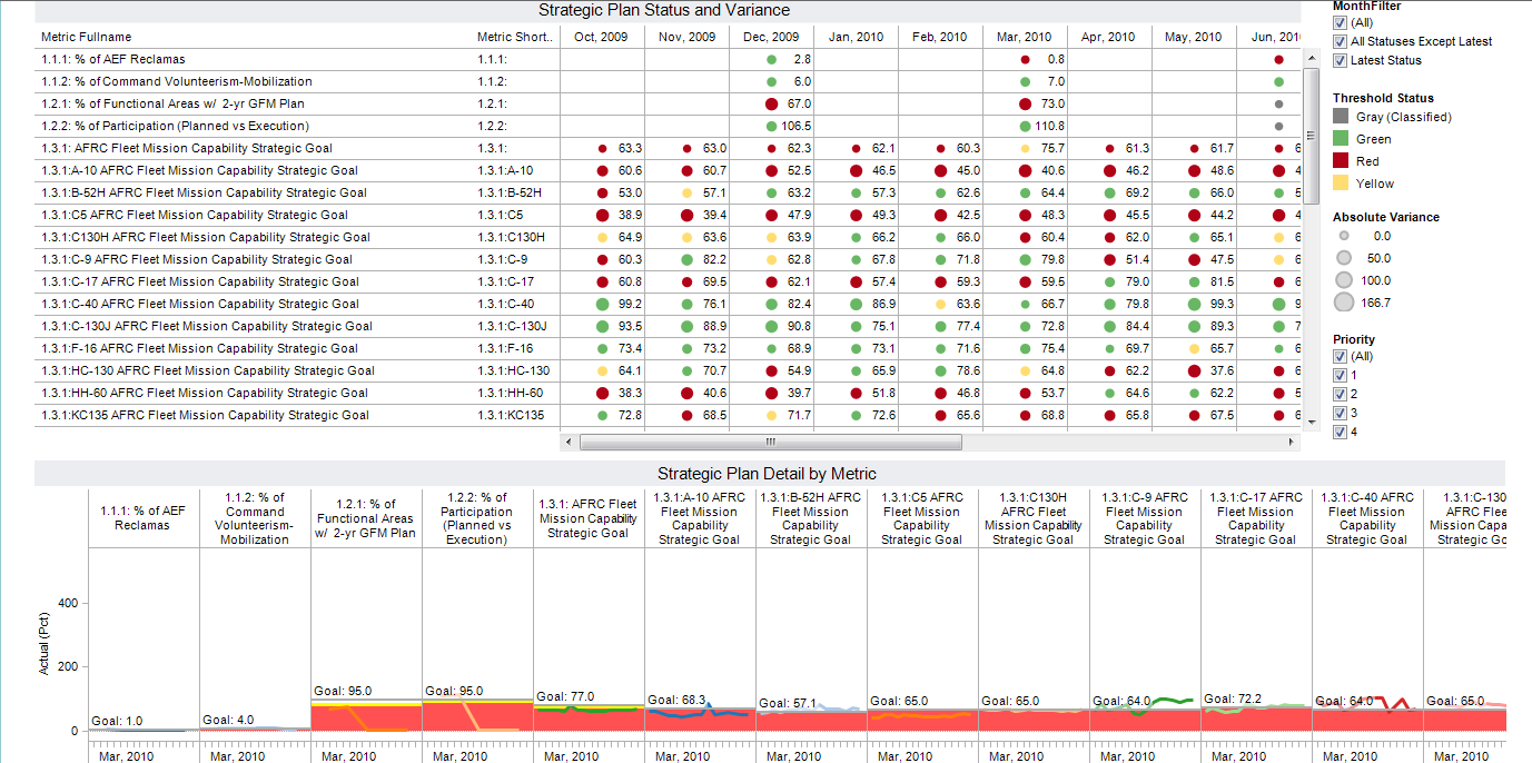
A Strategic Planner dashboard,
showing the relationship between "planned" and "actual" for a
set of metrics, and drilling down into the detailed values over time,
for all metrics.
The size of each circle in the summary table indicates the variance of actual from planned. Bigger circle means bigger variance.
Note the red and yellow areas in the detail table, indicating the thresholds defined for a particular metric.
A CIO Dashboard,
dividing a CIO's portfolio of software and hardware, year by year,
with two levels of drilldown. This one shows drilling into Software
costs in FY 2009:

Want to know more? Start with my 10 Easy Tips for Getting the Most out of Tableau quick startup guide!
Mark Smith
7B Software, Inc.